Gradient is a signal
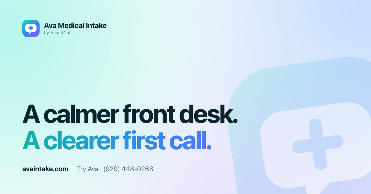
Use the aurora gradient on the mark, the second line of a headline or a single highlight — never as a full-page fill behind long text.
Brand kit
The marks, colors and type used across avaintake.com. For partners, press and our own team: please use the files as supplied and keep clear space around the mark.
Color
Calm white space carries the page. The teal–blue–violet aurora is reserved for the mark, highlights and one primary action per view.
#0B2530Text, dark surfaces
#0FB5A6Primary action, signals
#3B82F6Gradient midpoint, links
#8B5CF6Gradient end, accents
#F4FAFBPage background
#FFFFFFCards at 72% opacity
Typography
Plus Jakarta Sans throughout: 750 for headlines with tight tracking, 400–600 for reading and interface text.
Aa
Display · headlines, prices, numbers
ABCDEFGHIJKLM
NOPQRSTUVWXYZ
abcdefghijklm
nopqrstuvwxyz
0123456789 $ % ↗
Text · interface, articles, forms
Usage
Use the aurora gradient on the mark, the second line of a headline or a single highlight — never as a full-page fill behind long text.
Translucent cards sit on Mist or the aurora field with at least 24 px of padding. Do not stack glass on glass.
Imagery and examples show general office information. Never depict patient records, symptoms or clinical data.
Downloads
Vector marks, lockups, social card and tokens. Fonts are open-source (SIL Open Font License).
Your workflow, first
Bring the calls you want covered. We’ll agree the script, handoff and limits.